Taking the Arcturus Design System from 0 - 1 with a centralised team
My Roles
- Product Designer
- Design Systems Lead
Responsibilities
- Component creation
- Pattern definition
- Prototyping
- Documentation
- Stakeholder engagement
- Requirement gathering
- Cross discipline collaboration
- User research
- Team leadership & mentoring
Team
- 2 Product Designers
- 3 Developers
- 1 Scrum Master
Tools
- Figma
- Zeroheight
- Chromatic
- Storybook
- Tokens Studio
Years
- 2022-2024
Intro
Alcumus were moving into a period of digital transformation and recognised the benefits that a well managed, flexible and scalable Design System could bring to their journey.
The organisation wanted to modernise legacy digital products, create wholly new experiences and bring acquired products under the Alcumus brand umbrella.
There had been previous attempts to create separated Figma UI libraries and React components, but a cohesive and successful strategy had yet to emerge. Our centralised Design System Team was to be the solution.
How might we create a scalable, flexible & effective Design System?
As with any project, it had to begin with requirements gathering. Engaging with stakeholders and other product teams, we gained an understanding of the wider product roadmap.
Working alongside our scrum master, I managed the backlog in Jira whilst defining the roadmap in Confluence; mapping out up to 7 sprints in advance. It was important to keep in mind that the further from the current point in time the plans, the less certain they were, so being willing to change plans based on new information was key.
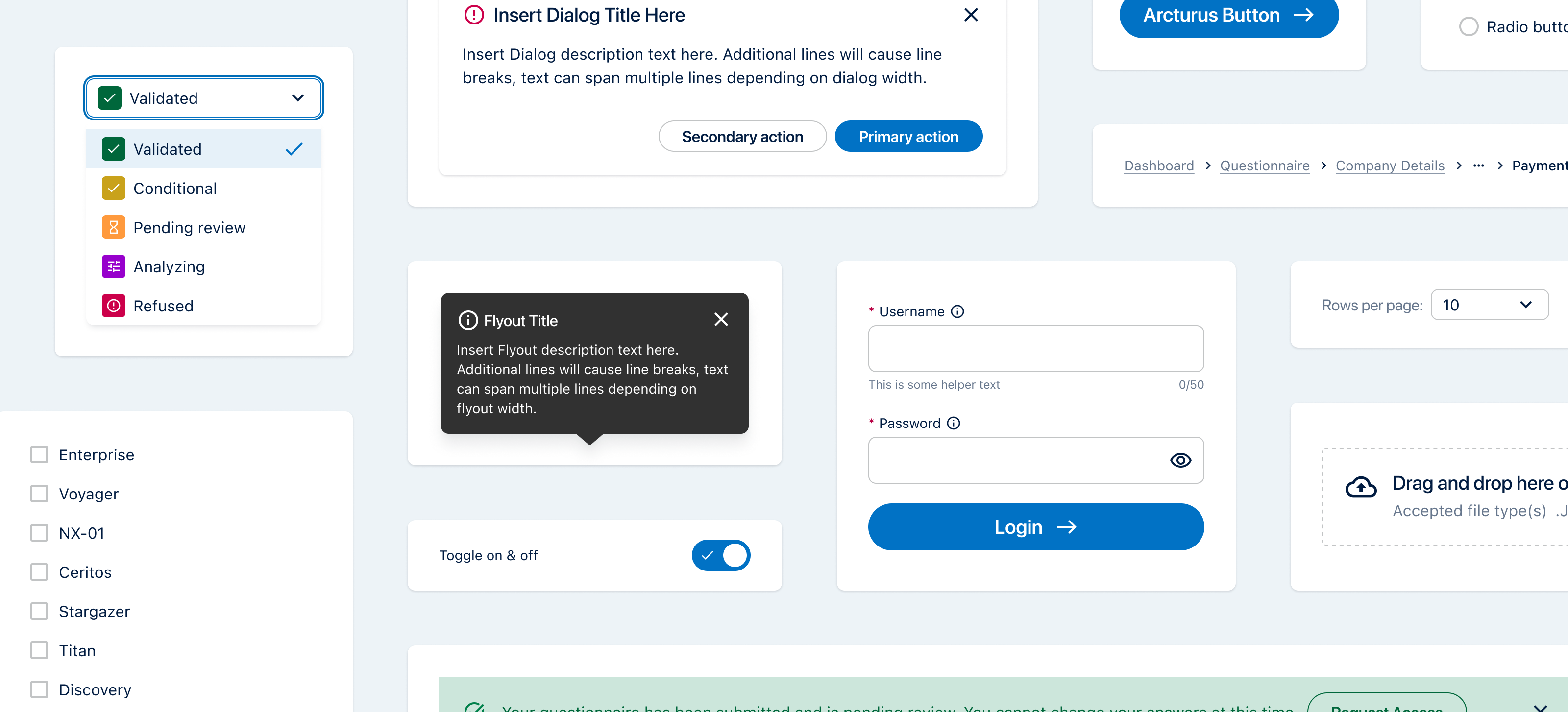
The roadmap was focused on the needs of other product squads, split between the JIT model and longer term implementation. Components were designed and delivered to immediate requirements but built to be scalable. At the same time, we implemented foundations such as design tokens and iconography, which reduced the effort of managing additions or changes.
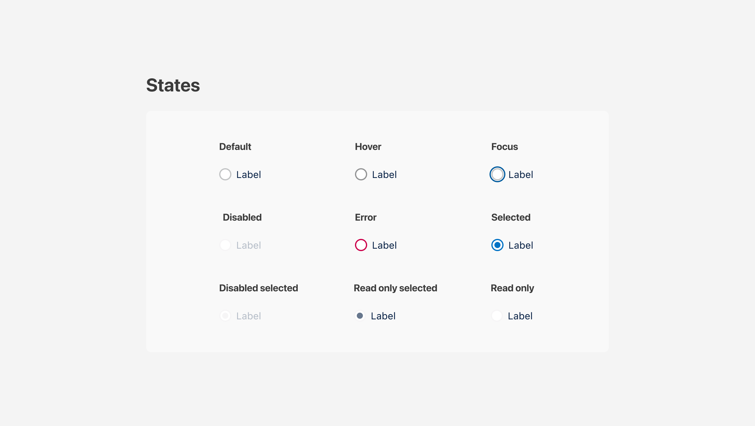
WCAG and ADA informed the accessibility requirements of the Arcturus Design System; colour contrasts, text readability, screen reader and non-mouse interaction models were all part of each components creation.
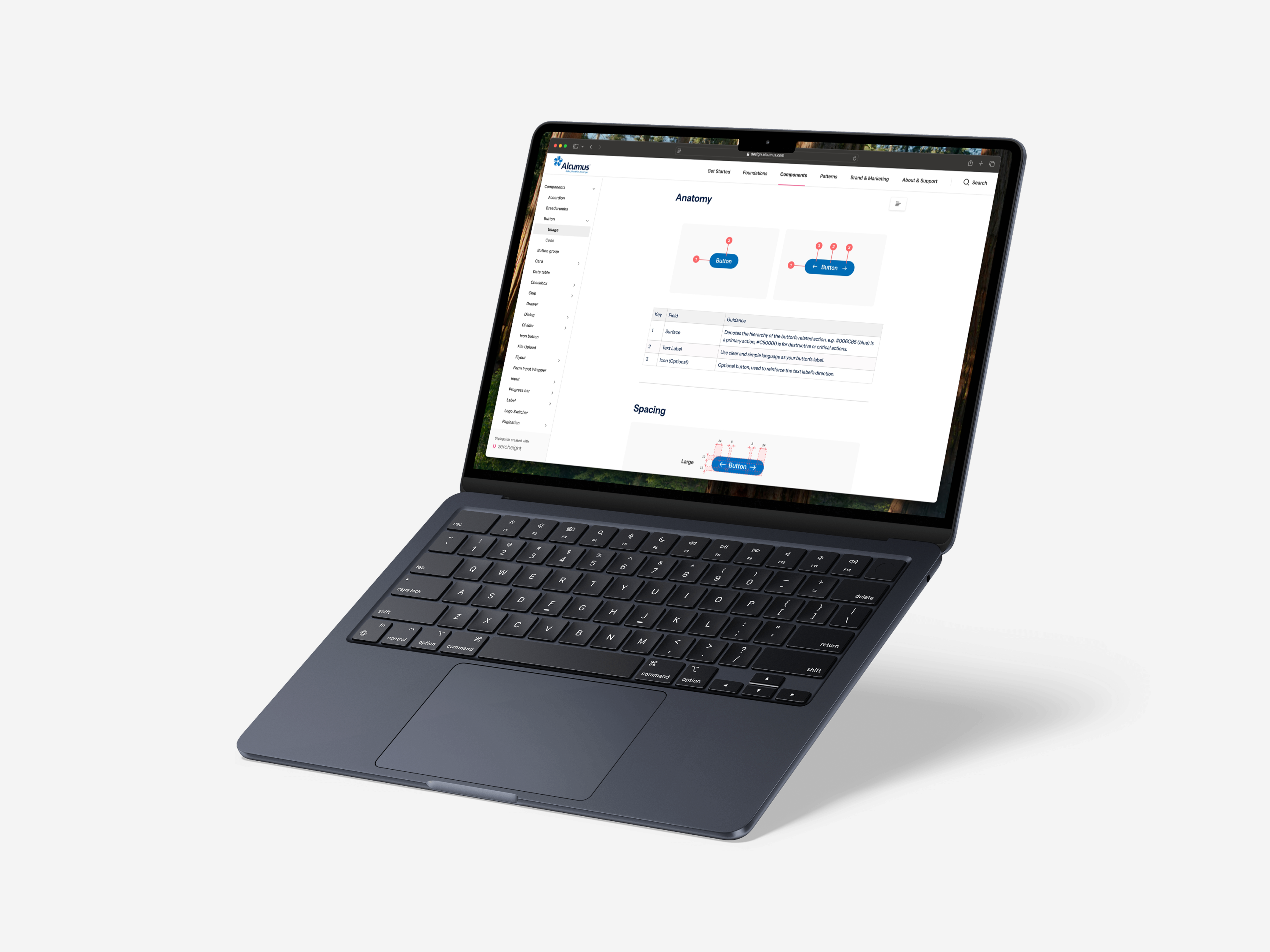
Documentation, for developers in Storybook and designers in zeroheight, was created alongside each component or pattern, ready to go the moment it was released.
Equally important as the working parts of the design system, was the wider communication about and perception of it.
We held bi-weekly drop-in clinics, rotating between open Q&A sessions and prepared presentations about the system and its benefits. We also regularly presented on the status of our roadmap and the successes we had achieved during the internal Tech Group’s town halls, which included senior leadership.
The Process
- Requirements Discovery
I would hold discussions and workshops with stakeholders to make sure our components were aligned with the wider product roadmap. These sessions would form the basis of our requirement gathering.
- Refine requirements with the team
Once initial requirements had been gathered, the team would review and refine them together to make sure they were deliverable and sensible.
- Design component in Figma, creating or applying variables and design tokens
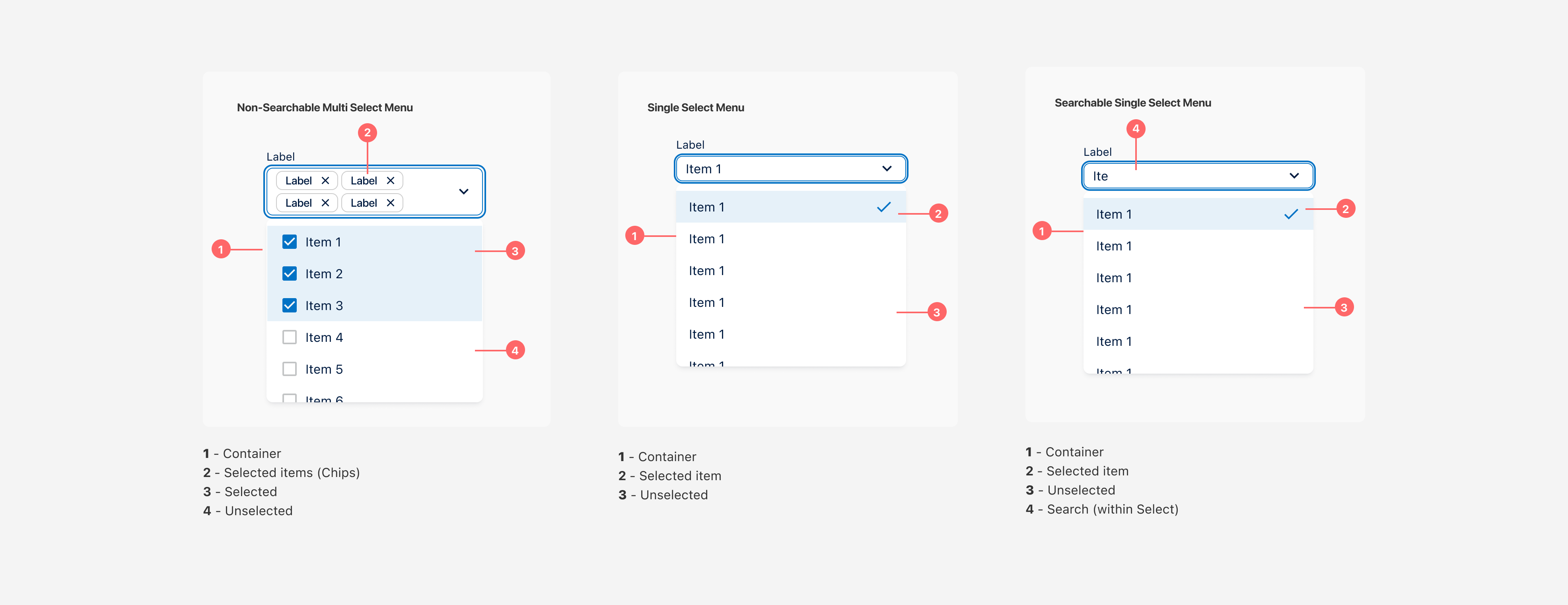
Myself and the other product designer on the team would each undertake the design of components in Figma. Components were constructed based on the Atomic Design principles.
- Review with stakeholders & DS engineers for feedback
Once designs had reached a reviewable stage, we would share them with stakeholders and other product designers to gain feedback. Designs were also shared with the squad engineers at this point to ensure we weren’t promising more than what was possible.
- Rapidly iterate designs
We’d take the feedback and rapidly iterate on designs and features before opening up for another round of feedback.
- Refine development requirements with the DS engineers
Once designs were agreed we would hold refinement sessions with the whole design system squad.
- Create documentation on zeroheight whilst components are developed
Documentation would be created in Figma and matched in zeroheight. Storybook documentation would be created as part of the React component.
- Collaborate with engineers as React components are developed. Assist with design token integration
Collaborating with engineers is an important part of my process, no matter the project. Frequent discussions on features and implmentation for components was a mainstay of our squad's workday.
- Review developed components in Chromatic & Storybook
Chromatic quickly become one of my favour tools, allowing for quick iteration and testing of UI changes in a safe environment. Especially valuable for design token tweaks.
- Release finalised components & communicate with stakeholders/product teams
We ran with a 'release per component' schedule, to allow for quicker changes. Each release came with an internal announcement, with notes.
- Review usage and gather feedback
We regularly conducted surveys and made feedback requests with our adopters. Their input was invaluable for iterative improvements.
- Begin the process again for continual iterative releases
A design system is never really 'done'. Improvements and refinements, driven by user requirements, are always possible.
The Results
The Arcturus Design System resulted in a 60% efficiency gain for Product Designers and UI Engineers, leading a shorter development cycle.
Design tokens facilitated the reskinning of several acquired products, reducing costs and time required to bring them under the Alcumus banner.
Legacy products were modernised with the new React components and branding updates, leading to a better user experience, customer satisfaction and stronger brand position.
The new products also satisfied the legal requirements of meeting the WCAG/ADA guidelines for EMEA and North American digital experiences.
Get in touch
-
Email
pete@anomalyinc.co.uk
-
Call
+44 (0)7540 187 132
-
LinkedIn
www.linkedin.com/in/anomalyinc